Wednesday, December 24, 2008

Merry Christmas!

Apart from all the hot UX topics like Project Renaissance, the New Notes in Writer, this post is dedicated to ... Christmas.

We wish all the people around OpenOffice.org a peaceful time. Enjoy meeting your family and your friends!


Frank & Christoph

Saturday, December 20, 2008

OpenOffice.org User Survey Data from 11-12/2008

I have uploaded the data from the OpenOffice.org User Survey. It includes 160981 responses from November 1 to December 18, 2008. 116313 are full responses and 44668 are not completely filled out responses. Survey language is English only.

Please find the Calc spreadsheet here:
http://wiki.services.openoffice.org/wiki/Image:OOoUserSurvey2008.ods

We will have a deeper look at the data to get answers for our OOo personas next year.

Best regards,

Frank

Wednesday, December 10, 2008

Results from IsoMetrics-S usability evaluation survey of Writer, Calc and Impress

I uploaded the most important results to our project page. You'll find there average ratings, standard deviation, and a chart to compare the performance of Writer, Calc and impress as evaluated by the employees of VBG. I also left some comments and a view discussion points.

There is a lot more to discuss but I did not have time to write down all issues. The page will grow constantly when I am back from vacation next year :-).

Best,
Andreas

Sunday, December 7, 2008

OOo Con 2008 Picture Gallery

I just found out that our Chinese colleagues uploaded a bunch of photographs of the OOo conference. Here's the link.

Enjoy!

Best,
Andreas

Friday, December 5, 2008

Project Renaissance: JavaFX for prototyping

Hi folks,

As you might have noticed, yesterday the JavaFX 1.0 was released into the wild. I am impressed how much progress the JavaFX group has made after the first RC, the amount of samples is impressive. So is the website, I very much like the design.

Today, I just played around a bit with Netbeans 6.5 and JavaFX to see how useful this technology could possibly be for us during the Renaissance Project. Specifically during the design phase. So far, I have the impression that rapid prototyping of mid and high fidelity UI prototypes would work pretty smoothly with JavaFX. The API has now a lot of potential and a very good online documentation. Besides, drag & drop of elements in Netbeans works fine.

The next thing I was planning to check out is the cooperation with Adobe Illustrator and Photoshop files. It should be possible to import images into JavaFX with a plugin. I’ve already seen the sample which is available on the JavaFX website.

So, any opinions how we could use this great technology for prototyping when the time comes?

Best,
Andreas

Wednesday, December 3, 2008

Presentations of the World Usability Day 2008

I just want to let you know that the presentations (most in German sorry about that) showed at the Word Usability Day 2008 in Hamburg are now available online. The videos will follow within the next couple of days.

At this years World Usability Day in Hamburg we had a lot of interesting talks, but with respect to the Renaissance Project I'd like to recommend to a look a these four:

Kommerzielle Ethnographie - ein Ansatz für Innovationen
James Kalbach, LexisNexis

OpenOffice.org User Feedback Programm - Optimierung der Gebrauchstauglichkeit basierend auf quantitativen Daten
Christian Jansen, Andreas Bartel, Sun Microsystems

Pragmatisches UCD für die Neuentwicklung von bahn.de
Elena Shalman, Janco Zehe, Namics


Interaction Design - Grundlagen und Prinzipien

Dirk Platzek, Wunschfeld Interaction Design


Enjoy the slides
Best,
Christian

Tuesday, December 2, 2008

Havy Traffic on the Wiki since project announcement

Holy cow! You might have noticed that our Wiki just went down several times in the last two hours. I mean the traffic is impressive! Since the announcement of the Renaissance Project, the page has been accessed over 10.000 times. However, as I was editing some project details, it was less amusing to lose content every now and then. The servers seemed to handle the run not that well.

Best,
Andreas

Friday, November 28, 2008

Project “Renaissance” Kick-Off

Project Renaissance, to rethink the graphical user interface (GUI) and interaction of OpenOffice.org, was announced on OOoCon 2008 and has been officially launched this week. Renaissance is a long running project and will start from scratch, so please do not expect to see something in OOo 3.1.

Some details about the project
The project is divided in three phases:
  1. Research
  2. Design
  3. Evaluation
Currently we are in phase 1 where we want to understand our users before we start designing anything. We will do usage tracking to get real data what our users do. We do surveys to understand who our users are and what they think about the product and we will do a lot more of things to understand our users (i.e. focus groups, Isometrics survey ). In phase 2 we will not limit ourselves to the possibilities of our current OOo GUI toolkit. We will create a list of requirements and the development will work to create a framework that could fulfill these requirements.

The Problem
Why do we run this project?
  • OpenOffice.org users complain about its cumbersome and outdated graphical user interface (GUI)
  • A great deal of functionality is hidden in many overstuffed toolbars, poorly structured menus and complex dialogs
  • Functions are thus difficult to access for novice users or too inefficient to use for expert users
  • In addition, the GUI offers an antiquated look & feel which is hardly capable to communicate innovation and to create joy of use
Our Mission

“Create a User interface so that OpenOffice.org becomes the users' choice not only out of need but also out of desire.”

Our Goal
... to know and to understand our users as they are, and to help them accomplish what they want to, by providing efficient access to valuable functionality through a desirable user interface.

Scope of the Project

We want to rethink the interaction and visual design of OOo. We do not want to build new features.

Project Home
Project Renaissance uses the Wiki for project coordination. As we start from scratch, you will currently find only basic information around the project. Details about communication channels (Wiki, Blogs, mailing lists) will follow as soon as possible.

This is a very important project for OOo and we are really looking forward working with the OOo community! So please stay tuned and participate!

Best regards,

Frank Loehmann
OOo User Experience Project Lead

Monday, November 24, 2008

I'm Back After 3 Years


Amazing, but true! In Germany it is possible to take three years of parental leave.
When I returned to the office a few weeks ago, some guys couldn't believe it had been so long already. I told them they were coding when I left and they are still typing code now, so that's why they didn't even notice the passing of time. :-)

My parental leave ended when my little boy turned 3. It wasn't three years of only fun and games, though. When he was only two months old I realized that he had stopped breathing, so after intensive care and diagnosis, the doctors sent us home with a monitor. You know, electrodes on his chest, oxygen sensor on his foot, alarms sounding whenever he stopped breathing or the sensor was faulty, etc. "Fun" for the whole family, but at least it was only a matter of time till his body repaired the bugs in the software. Now he goes to preschool and is full of mischief. He is bright, busy and bilingual---speaking German (like Papa) and English (like Mama).

I'm so glad to still be an employee at Sun, but, aside from now being only part-time, my job has changed. I used to be active in the community mostly in marketing and German native lang, but may be remembered most as the enthusiastic linguist in charge of UI text in the German and English versions of the OpenOffice.org/StarOffice office suite.
If you are also passionate about User Interface text, you might be interested in the style guide I wrote before I left on leave.

Now, I am no longer in charge of text on the software design team. So please don't send me those issues/bugs! ;-) My current focus is user experience in general and to this aim I have joined the OpenOffice.org website mailing list because I thought I'd help improve the usability of the wiki. This and other similar work is something I can do easily from home and at odd hours, as is often necessary when small children are involved. Sun is a great employer, especially since I get a SunRay with peaceful and productive network access from home or office. I'm a big fan of computer people (I married a Java developer, of course!), but I am really quite pleased when I can do my work and let them do theirs. ;-)

I plan to write more about work and life on this blog. This is my first blogging experience and yet I already feel like a happy little pixel in the global picture.

Friday, November 21, 2008

ODF documents statistics

As Christian mentioned in his post here, the IBM Symphony UX team did some statistical analysis of text documents on the web and they presented the results at the conference in Beijing. Since then, I could not sleep and was wondering how they did it and how we could possibly do similar things since their code is not available yet.

So, I just started sniffing around in the XML files of one of my own ODTs and look what I found:


This is a line from the meta.xml file that describes some basic document statistics. It includes the number of tables, images, other objects, pages, paragraphs, words, and even characters.

As a consequence, it is amazingly easy to get these statistics from ODF documents, assuming that every ODF file has this information included. I will bug Svante a bit about that to figure out some more details.

Then, I checked out the odftoolkit.org page and the opportunities the framework offers. So here is shot, how about a small and nice piece of Java code to parse the exact meta.xml files within ODF documents and to output a Calc spreadsheet with the statistics? I’d love that and the information would actually help us to make particular decisions within the Renaissance project.

So, what do you think of that, any volunteers?

Best,
Andreas

Tuesday, November 18, 2008

Wordle, I love this tool!

Recently, I posted a survey on my Linkedin account (Q&A section) to collect some feedback to the following question "If you were offered Microsoft Office 2007 or OpenOffice.org 3.0, BOTH for free, which would you chose and for what reasons?". I was pretty much interested for what reasons people would or would not prefer OOo 3.0 over MSO 2007. The survey is closed now and I received 64 answers. The feedback is very interesting and valueable, as soon as I am through with the analysis, I will post the important things here.

However, so far I just tried to make some sense out of it and put it into Wordle. A very cool tool, I just love it. You can insert plain text, from a survey for instance, and this tool creates a nice word cloud of the input. Very useful if you want to see which words occur in the feedback and how often. So, without any further comments, here is the result!


Enjoy!

Best,
Andreas

Monday, November 17, 2008

OOoCon 2008. What's next?

Writing this blog post feels a bit like sharing my final thoughts about this year's OpenOffice.org conference. I still cannot believe that only one week ago, I sat in a plane on my way home - the last week passed by without noticing it.

Okay, even my connecting fly just passed by ... because our plane from Beijing was pretty late. So I "enjoyed" one additional night in a hotel nearby. At least, it was payed by the airline, but that did not make it more comfortable :-)


After my job took total control over me, I finally managed to upload my photos to share it with ... the world ... and you. I added some comments, so today I will just skip the explanation about what happened on our last day in Beijing (from the tourist point-of-view).

But, the days in China were not only interesting in terms of OpenOffice.org or visiting Beijing's sights. It was also very helpful for me to get some personal feedback by other community members. One example: People got the impression that the structure and argumentation in my emails made many discussion somewhat "final". From their point-of-view, this is a big problem for new UX members who want to contribute ... those members may be somewhat "frightened". I think that such kind of feedback is very valuable, and I will try to consider that in the future. And if you will ever notice that I "lost my mind" - remind me, please :-)

There are also other things I don't want to get lost. On my way back, I thought about how we can make our contributions more efficient and better in quality to get them better adopted by the developers. Another thought was how we can fulfill the mission statement of the new project "Renaissance" - creating innovation. The funny thing is, that most of the ideas to achieve that have already been mentioned in the last months. Either there was no time on my side or the discussion just got lost... So after this year's conference, my personal goals are:
  • Create a place to collect new ideas. You may remember the discussion about UX brainstorming, I mentioned something like the "UX brainwaves" blog. However it will be finally called, it would be great to collect and discuss ideas in one place.
  • Get a better understanding for data driven UX approaches. Some months ago, I asked what the UX community thinks about approaches like Personas. Personally, I'm convinced that this is the way to go for complex activities like "Project Renaissance".
  • Working on the Writer's notes, again. After presenting the Notes development to the public, I would like to re-intensify my work on them. Yesterday I worked on the "Notes Ruler Control" which hopefully will make it into Writer 3.1. That would be great!
These are my personal favorites, so please feel free to propose topics which you think are important for UX. In the best of all cases, our goals match - especially for the ideas blog the UX project needs help: technical realization, design, ... and ideas. So is there anybody who wants to mastermind that?

That's it for today. Cheers,
Christoph

OOo Con 2008 --- Wrap Up

I was really impressed about the fact that this years OpenOffice.org Conference had 9(!) UX-related talks. This is really a success and emphases the importance of user experience in the whole OpenOffice.org Project. IBM and RedFlag presented [1,2] some pretty cool UI improvements realized on top of OpenOffice.org:


Image courtesy of RedFlag2000 Software CO.,LTD [3]

We've received pretty positive feedback on the User Feedback program and the Isometrics questionnaire [4]. Another talk I'd would like to mention is the "Learn more about office users - Feature usage study by document element statistic" presentation [5] (sadly not publish now). The IBM Lotus Symphony UX Team analyzed 1600 ODF, DOC public available documents for feature usage analysis based on document element statistics. They've figured out that:

* 41% of all documents contain tables
* 95% of all documents contain less than 10000 word (approx. 30 Pages)

As mentioned earlier, it is good to see that interest in UX-related stuff exist and rises. I hope that the next OOo Con brings up even more talks on User Experience related topics.

Best,
Christian


[1] href="http://marketing.openoffice.org/ooocon2008/programme/friday_1464.odp
[2] href="http://marketing.openoffice.org/ooocon2008/programme/friday_1484.pdf
[3] href="http://en.redoffice.com.cn
[4] href="http://marketing.openoffice.org/ooocon2008/programme/friday_1447.pdf
[5] href="http://marketing.openoffice.org/ooocon2008/programm/friday_abstracts.html#a1467

Friday, November 14, 2008

The UX Team at the World Usability Day in Hamburg

Yesterday, members of the UX project actively and passively attended the World Usability Day in Hamburg. Christian and myself gave a presentation about the Usage Tracking Extensions and the IsoMetrics-S questionnaire. Basically we talked about same things as during our presentation in Beijing, but this time in German. The feedback was quite nice, people were really interested and impressed, to some extent, that we have chosen a data-driven methodology to improve OpenOffice.org.

However, other contributors had very good presentations, too. James Kalbach, for instance, gave a nice talk about Commercial Ethnography. That was my favorite. Since we plan to do similar research in form of ethnographic interviews in the context of the UI redesign, that talk offered some insights how others successfully use qualitative methods for UX design. People from Xing.com gave a nice introduction about their first experiences combining Agile software development and User Centered Design. Also an interesting and a hot topic in the UX community since Agile is the way to do development nowadays.

Overall, I was impressed by the amount of attendees and the amount of usability professionals present at this local event. By the way, we were able to distribute a lot of OpenOffice.org flyers and writing blocks. So, in terms of OpenOffice.org marketing, this event was also a success.

Best,
Andreas

Tuesday, November 11, 2008

OOo Con 2008 captured in 2D

Hi folks!

just a short notice, I uploaded some of my OO.o Con pictures. Here comes the link:

http://picasaweb.google.com/send.to.andreas/OOoCon2008InBeijing

Two things I'd like to share. I really liked the talks, a lot of UX. Actually, more than I expected. Way to go! Being sick and not able to attend several important post mortem events, that is something I really did not like :-(

Best,
Andreas

Saturday, November 8, 2008

Get Three for One

Today, you will get some news from three days in one blog post. Unfortunately, the preparation of our presentation took more time than expected. But, let's just start with...

Thursday: Project Renaissance

Thursday was the second day of the conference - and it was still very inspiring. The most interesting part (at least for me *g*) was the announcement given by Frank Loehmann of the "Project Renaissance" (presentation "The State of the User Experience project"). This activity will lead to a new user interface and interaction concepts for OpenOffice.org. You are not dreaming, it seems to be true :-)

What should be achieved was formulated in the mission statement: "Create a User Interface so that OpenOffice.org becomes the users' choice not only out of need but also out of desire." Here is a snapshot of the presentation:


The announcement is just a start and can be interpreted like a commitment of Sun to support such an activity. So there are no concept or mockups available, but we all may contribute to improve OpenOffice.org concerning UX (usability, productivity, enjoyment). I asked Frank and he will provide more information to the community in the next few days.

Until then, we may have a look how Chinese travelers work as a community to support the bus driver (photo taken at the evening):


Friday: Our Presentation and The Closing Ceremony

Unfortunately, I do not have any photos of "Making the New Notes - Community, Collaboration, Concepts". Nevertheless, I think we did provide some useful insight in our Notes2 activity. But you may want to judge for yourself...

We had the last presentation slot and then moved on to a very fine hotel to attend the closing ceremony. Some speakers took us some days back in time and provided insight in their view of how the community evolved. Then, delicious meals were offered and we had the chance to see some Chinese acts (magicians, acrobats, fighters, ...):

Here, I would like to say thank you to our Chinese community and the sponsors which prepared and financed the OOoCon. My overall impression is that everything was really excellent! So again, a big thank you to all the supporters and volunteers!!!

Saturday: Tourist Trip Starts

When we registered, we have been offered to attend a two days tourist trip in the area of Beijing. So after getting up really early, we went to the "Great Wall" and back to Beijing to visit the "Bird's Nest". It is really impressive and it is hardly imaginable that, e.g. for the latter one, the Olympic Games have been there only few months ago. Between those sightseeing spots, there have be some arrangements to visit a Jade factory and a Silk factory - let's say that this caused discussion in our group :-)

At the evening, we went on to buy some small gifts and to get something to eat. And, like every day, the rest of the evening was spent in the hotel bar to meet the other community members and to strengthen our relationships. I'm pretty sure that I will miss some of the people when I leave...

Oh, due to the preparation of my departure, I'm not sure if it is possible for me to blog tomorrow.

Bye,
Christoph

Wednesday, November 5, 2008

Nothing really thrilling today, but at least my first attendance on an OpenOffice.org conference...

The opening ceremony was held in a official building (Diaoyutai State Guesthouse) which was decorated in the colors of the OOoCon 2008. Although being a bit different in comparison with the 'blue' OpenOffice.org, all media (presentation screens, banners, cards, ...) seem to be carefully designed and are very consistent. It was a pleasure to look at:


After the ceremony, which seemed to be a bit long, we drove on to the Peking University. There, the Sun User Experience team members Bettina Haberer and Christian Jansen held the first presentation: "What's New in OpenOffice.org 3.0?". Although there were some issues with the data projector and the internet connection, they demonstrated how OpenOffice.org did improve over time. And now you can judge if the persons on the picture did improve, too :-)


The evening was spent together with e.g. the Sun UX team, some Sun Writer team members and the German community. Like the evenings before, there were discussions about the project, how to handle issues, how to manage new features in Writer and the quality of the Chinese beer. Not bad, by the way. So we "ended up" in the bar of the hotel. And, most probably, some people may still be there... As I said, no surprise today.


So enjoy the rest of your day,

Christoph

Tuesday, November 4, 2008

Oh, it's pretty late!

Wow, it's about 2:30 am now... it has been a great day before the conference really starts (great except playing the tourist).

So, after an extensive breakfast, some attendees moved towards a coffee bar to get some "real coffee". And, some bits and bytes from the "free" (as in beer) WLAN internet connection. I think, it has been a very funny discussion and I enjoyed to get in touch with some German community members I didn't knew much about, e.g. Jacqueline Rahemipour, André Schnabel, Stefan Taxhet and Andreas Mantke (see the post yesterday):

At 2 pm we had finished to work on our mails. We went back to the hotel and picked up some members of the Sun User Experience team and Max who just arrived. They starved from hunger. So we continued our discussion during a great meal. We decided that the most delicious dish was the "exploded chicken" (own interpretation). Let's have a look at Christian Jansen (Sun UX), Frank Loehmann (Sun UX), Max Odendahl (OOo development) and Andreas Mantke starting the meal (from left to right):

After being filled with an enourmous amount and variety of food, we went on to see the "Lama Temple" which is located in the center of the city. Like yesterday, we missed the opening hours by a few minutes ... Ouch! Instead, we took the chance and walked around in the smaller (and maybe less beautiful, but also interesting) streets - like in the picture here:


Do you miss something? I think yes, because I didn't talk about the next meal.... A very large group of people joined a meeting in a restaurant nearby. Perfect dinner which brought up a very interesting UX discussion. One of the people involved was Cor Nouws (OOo contributor, e.g. NL marketing contact). From left to right, front to rear ... various people except me:


Finally, I don't want you to miss two very interesting UX bits I found today, both located in the Beijing metro. First, there is a very interesting button on the ticket vending machine:

The description is rather far away from the button, and the pictures itself help nothing at least. But what could it be on the first sight? It is round, red and protected by a transparent cover to avoid unintended activation. Best guesses: The self destruction mechnism? The ultra-secred rocket launcher? No, it seems to be the help button... but I still don't know if it is for emergency use. Anyway, we should re-think the OpenOffice.org menu item to make it look similar to prevent people from opening the help. This would greatly reduce the efforts for maintaining it :-)

A much better idea was to put braille texts on the handrails for the staircases. This idea rocks and shows how information can be integrated within physical objects: the staircase both leads into a certain direction and will be touched most propably (at least blind people will use it).

Now, I will get in touch with my bed. I'm looking forward for my first official conference day...


Bye, Christoph

Monday, November 3, 2008

Christoph, this is Beijing. Beijing, this is Christoph.

Finally, I'm in Beijing. It's hard to believe...

The flight was good and I arrived at the Beijing Capital Airport at about 10 am. Before I left the airport building, I noticed a guy with an "OpenOffice.org" neck strap and made my very first contact with another attendee: Claudio Filho. So people, please don't forget those important indicators! I don't have one yet ... and my excuse: this is my first OOoCon.

Together, we took the bus to the hotel. The closer we came to our destination, the more attendees we met. In the hotel, we met Peter Junge, who is one of the main conference organizers. We took the chance and went to lunch with him - so he was in charge to select some very delicious dishes for us. Thanks Peter, it was ... yummi!


The picture shows our group before the meal. That's better, because afterwards the table looked less shiny. We will soon get used to chopsticks :-) Anyway, from left to right: Christoph (it's me), Claudio Filho (BrOffice.org Project), Florian Reuter (Novell), Andreas Mantke (German OpenOffice.org Portable Project) and Peter Junge (RedFlag 2000).

After the meal, some of us headed towards the "Big Bell Temple". Unfortunately, the area was closed in the moment when we just arrived, so we missed that opportunity. Instead, we took a photo from Mr. Small Bell.


Bang. That wasn't the bell... the jetlag came instantly and we hurried up to get "home" and some sleep.

Later in the evening (I went out to get some fresh air), I noticed that the entrance hall now looks like an real entrance hall (tomorrow, I expect more people to fill the space).


After all, it has been a very nice start for me! So I'm looking forward to see the other UX team members who will join tomorrow...

See (and meet?) you!
Christoph

Thursday, October 30, 2008

See You in Beijing!

Long time no blog post. Believe me that will change soon!

Christoph Noack, Bettina Haberer, Christian Jansen, Andreas Bartel, myself and many more UX team members will attend the OpenOffice.org Conference in Beijing next week.


Stay tuned and follow our State of the UX project presentation. There are great news!

So see you in Beijing!

Frank

Thursday, September 4, 2008

Interiour decoration - the colors of the new Notes

Colors are bad. Are they?

Some months ago, after the release of the OpenOffice.org 3.0 Beta, some Germans discussed the new Notes in a newsgroup (I don't remember the URL, sorry). There, one user referred to the notes being to colorful. He stated that it would have been better to use no color at all. Personally, I'm a little bit sad how this property of the Notes is perceived. So I would like to give some explanations a try.

Basically, color is an important information carrier and provides clues about the author of the notes. This is similar to the word processor of our biggest competitor. For me, it was no surprise that this request was estimated to be important to work on (different to other requirements which needed some more ... persuasiveness).

We only need colors. And...

The i-Team worked on it for several weeks: defining colors, gradient style, effect, visibility, ... Our requirements were (simplified):
  • provide a fresh and modern look, but avoid to distract the user from the actual text document
  • keep consistency with existing visual design work (e.g. with the Galaxy Icons Color Palette)
  • be based on the color palette of previous OpenOffice.org versions and the biggest competitors
  • consider the maximum number of different authors in the document
  • provide compatibility with the markups of the Change Tracking feature
Okay, so how do the colors actually look like? Let's have a look at the color table which has been developed...
But the competitor...

You may have noticed that there are some small differences between the application color palettes. I want to comment two of the decisions of the i-Team. First, the color of the first note is 'yellow' instead of 'red'. Although red is a nice markup color, we wanted most of the people to be able to recognize the little boxes as notes - similar to the sticky paper sheets in the real world. And, we are now somehow compatible with the visualization of notes in Calc. If you don't know what I'm talking about, try adding Notes for two different authors in the Microsoft Office applications Word, Excel and Impress. What a colorful world - they decided to use different visualizations (tested in Office 2003).

When we already have a look at Microsoft Office Word, you may have noticed that Word darkens the Note who currently has the focus. The result is a good recognizability of this note in comparison with the others, but the drawback is a clearly noticeable loss in text contrast. Remember, this is the Note the user views or edits at the moment. Personally, I don't understand that decision.

Let's have a look at a mockup which gives an overview over all the different colors and text elements. Although this is a rather old and chunky picture, you may get the point how it will finally look like... With the help of this picture, we checked the appearance on a variety of different monitors and displays.


Color is good. If you can perceive it!

At the beginning I said something about the importance of color in graphical representations. But there are people having problems to differentiate colors - maybe you know some of them personally (Wikipedia, Color Blindness). First, we checked our colors against color blindness with the help of the open source image application "The Gimp" which provides different filters to simulate color deficient vision. Look...
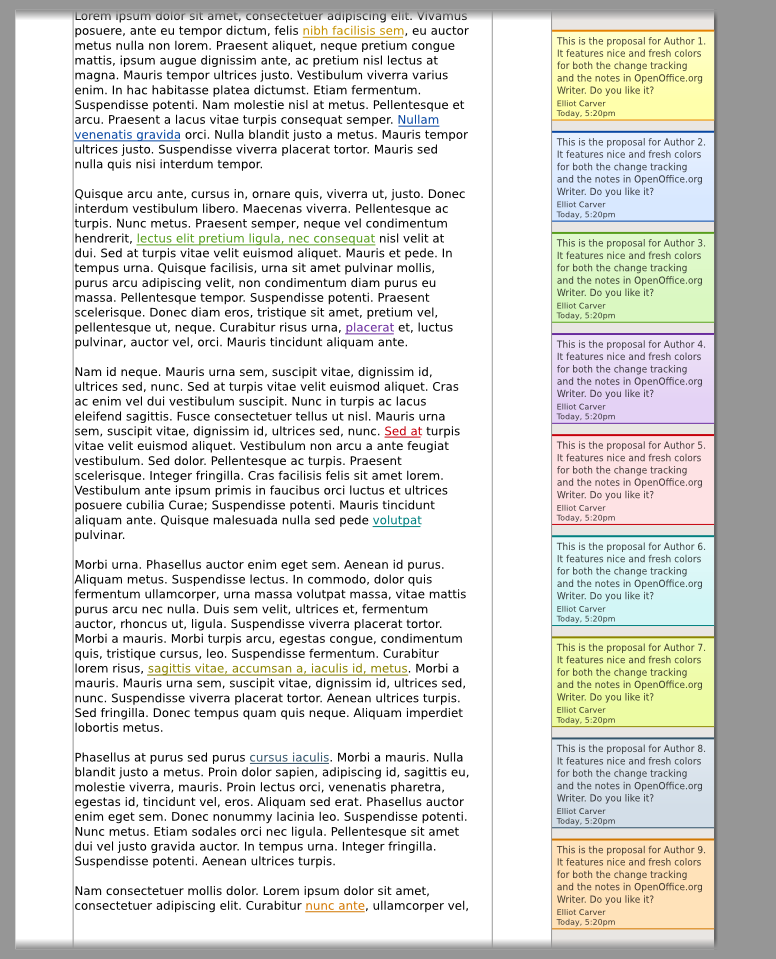
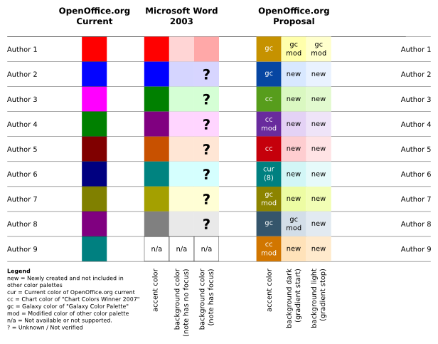
Yes, I'm not too glad that we can only guarantee to differentiate the first two or three authors. But you may agree that it is very hard to provide bright and decent pastel colors which differentiate well when considering such a high number of authors. This is already an issue with cheap monitors which have a limited viewing angle stability - same colors may appear different when displayed at opposite screen areas. And so we have to remember the most important principle when it comes to color: never code information exclusively with that. We respect that by showing the names of the authors in each Note.

People may not only have difficulties with colors, there are also other disabilities who have to be considered. Here is how it looks like, although it may hurt if you are not used to it...

That's it. So what is your opinion on how we worked and what was the outcome? We think color coded information is good, but we shouldn't rely on it. I experienced the selection of colors to be a balancing act of both providing a pleasing design and respecting all the users' needs. In any case, the i-Team hopes that you will be happy with the design we chose and that it'll bring freshness and improved usability for the upcoming OpenOffice.org 3.0 release.

If you want to know more about it, then please have a look at the Notes2 color wiki page. And, as always, if you have any comments or opinions to share - simply share it!

Have a nice day,
Christoph

Thursday, August 14, 2008

Let's do the Math

This time I'd like to point to something which is in early stage of development. The "OpenOffice.org Usage Feedback Extension" [1]


The OpenOffice.org Usage Feedback Extension is an extension that collects anonymous data about how OpenOffice.org is used. This information is used to better understand how people use OpenOffice.org.

Our plan is to have this extension final on release date of OpenOffice.org 3.0.

As mentioned above, the data will be used to do some statics on the usage of OpenOffice.org. For example: We can better figure out how frequently specific menu- and tool bar items are used. The collected data will help us to create a decision base for user interface changes. It allows us to decide better on defaults, or items displayed by default.

The anonymously collected data will be published in form of diagrams/tables on a page on OpenOffice.org.

As always, feedback and comments are welcome.
Directly here, or on the discussion page of the Extension Specification.

There is momentary nothing to download, but this will change soon.

Stay tuned.

[1] http://wiki.services.openoffice.org/wiki/User_Experience/OpenOffice.org_User_Feedback_Extension

Monday, August 11, 2008

OOo User Experience Project Lead Meeting in Hamburg

Sun Microsystems User Experience team had a meeting with Christoph, our OOo User Experience Co-Lead. Christoph stayed in Hamburg to meet his Notes2 iTeam, so we used this opportunity to prepare the upcoming quarterly review for Writer and to discuss general UX related things.


From top left to bottom right: Christoph Noack (OOo UX), Éric Savary (Sun QA), Max Odendahl (OOo Dev), Mathias Bauer (Sun Dev),
Christian Jansen (Sun UX), Andreas Martens (Sun Dev), Frank Loehmann (Sun UX)


I think the meeting was very productive and we also had much fun showing Christoph and Max a little bit of Hamburg at night. After dinner we went down to the harbour to have a look at the Hamburg Cruise Days. Nearly every ship/building was illuminated with blue light.


Blue illuminated Rickmer Rickmers and Disneys Lion King musical hall in the back.

I hope we can repeat those face to face meetings beside our weekly telephone calls.

Monday, July 7, 2008

Usability and handedness – is it considered at conceiving software?

Within the software products / tools I have ever installed and worked with I have never discovered one, which pointed explicitely to the consideration of handedness.
So it seems, that one is working with software, which is mostly (always?) designed for right handers.

Is this assumption right?

How to satisfy handedness?

To meet the need of right and left handers at conceiving software one needs to know and be able to identify, which hand is supported in which way.

Does it really suffice to switch the mouse keys and mirror the menu and toolbars?

What needs to be considered at conceptual design of software therefore? In my opinion this is a topic really worth mentioning.

Your feedback is welcome.


Best regards,

Bettina

Thursday, June 19, 2008

Improving the Usability: The new Extension Manager as an Example

I would like to introduce the new GUI of the Extension Manager.
The aim of this refining was to ease the use of this tool and giving it an appealing look.

The problem:
This dialog has formerly been rather overcrowded with all functions available at the same time and thus difficult to understand how to use.
The user was forced to consider too many steps before getting results, while beeing in the context of extensions which at that days were not in common use for every user.

The solution:
Which buttons need to be available all the time and which are only relevant for a selected extension? According that assignment the buttons got arranged and their visibility reduced, so that the user has certain functions only available if needed. That should help to keep the user's focus on the work flow.
We also reduced the number of further dialogs coming up on top of the Extension Manager at certain actions by integrating it within the UI.
Well, not many ways exist to arrange an appropriate UI for the purpose of handling extensions, the result shows similarity in the style of the well known Firefox.

Here are some pictures showing the old and new Extension Manager:


The old UI


The new UI: Adding an extension


The new UI: After adding an extension

Wednesday, June 18, 2008

Monday, June 16, 2008

Quarterly Review is done – what is next?

Some Quarterly Reviews for OOo are still running and some (i.e. the review for Calc) have already been finished.

The report of such a review consists of different sections. One section lists issues the teams are already working on and another the most important issues (i.e. a Top 20 of the highest voted issues). So now the question is how to start working on these most important issues to get things done?

I want to start the discussion on those issues as early as possible. If we have a good proposal in place, the chance to get those issues done is much higher. Furthermore we have the chance to do it on a high quality level if we do not start thinking about an issue when we have resources in development.

Discussions held in issues are often nonproductive, so I want to call for proposals, a kind of one pager, at the OOo Wiki. The issue itself just contains links to proposals but the discussion starts on the discuss@ux.openoffice.org mailing list. There could be more than one proposal for an issue, but in the end the UX team should recommend one proposal to development.

If the implementation of such an issue starts, the iTeam gets the supported proposal as a recommendation how to solve that issue. Maybe it is a good idea to have the original author(s) with that iTeam too.

Feedback welcome!

Best regards,

Frank

Monday, June 9, 2008

iPhone 2.0

At today's keynote, Steve Jobs presented the all new iPhone to the masses. No worries, this ain't gonna be another blog post about the product as such. Instead, I want to point out how Apple managed to really listen to the their customers and improve the iPhone exactly there where it failed to meet their needs. This company's ability to gather, interpret and appropriately use feedback is state of the art.

Read the whole keynote here.

Best,
Andreas

PS: This is what Apple’s senior vice president of Software Engineering, Bertrand Serlet, said about Snow Leopard, the next version of Mac OS X "In our continued effort to deliver the best user experience, we hit the pause button on new features to focus on perfecting the world’s most advanced operating system."

Saturday, June 7, 2008

Introducing our new member: Jennifer Wright

Who is Jennifer? Have you ever heard of her? I think not, but I hope we will make her or one of her friends come to life, soon. What we're talking about is using Personas in our development process.


Say Hello to Personas!

”Personas are fictitious characters that are created to represent the different user types within a targeted demographic that might use a site or product. Personas are most often used as part of a user-centered design process [...]” (Source: Wikipedia)

Why should we use Personas? To get: “Focus! Focus! Focus!”. And finally, the best OpenOffice.org we all can create.

Personas can help to remain the focus in our developments. Starting with requirements engineering, Personas can help to identify the functionality with most room for improvement or weighting requests for completely new features. You may just “ask” Jennifer what supports her most. For the interaction design, Personas may have special preferences, knowledge or even disabilities which affect the possible solutions. Using Personas means going straightforward.


How to Create Personas?

When creating Personas, you basically start by gathering real data from your users and identify similarities. You select the most important user types, for which fictitious characters are made up. These character traits make the information more vivid, manageable and understandable for all the people involved in the development process. And the data which the Personas are based on will make them believable.

Understandability and authenticity make them so valuable: Personas can greatly improve the communication inside the development team. And – also very important – that should work across all our activities and help us to achieve consistent solutions.

If you get the impression that this may also be useful for the other OpenOffice.org projects, you're right. Even Marketing, Documentation, ... may benefit from this approach.


What's Good Today? And What's Just Wrong?

So everything is bad? No, since we have payed attention to our users for a long time... Some data gathered in usability tests helped to identify and prioritize issues. All larger development activities are backed up by members of the User Experience team. The developers bring in years of experience with the product. And, there is a well-defined specification and design process for OpenOffice.org.

But looking more closely, you may discover small inconsistencies. Working in teams means that everybody wants to achieve the best for their users, but many have their own kind of “user prototype” in mind. Or, decisions are made up on very few requests and do not represent the needs of a larger user group. Or ... I think you got the point.

What we think can help is an improved common understanding. Guess what? Personas may help us to get there.


The Next Steps

So how to proceed? First we should avoid any rush, because this might be the only chance to introduce Personas. So what we might do is ...

  1. Answer the question, whether we think Personas are useful for OpenOffice.org.

  2. Select one or two first user types and collect the available data.

  3. Make up the Persona characters.

  4. Start promoting the Personas in the community and select the first development activities to make use of it.

  5. Further improve the Personas as we gain more insight in our user base.


The Big Challenge!

Although the Persona approach may sound simple, the devil is in the details. One of them is to convince all involved people like software developers, documentation or QA that this will work. “Work”, that means that it will improve our decision making, reduce development effort and improve the outcome of our activities. Now, they may just think that it is ridiculous to “talk” with those unreal persons or base decisions on such “paper” data. We have to make clear that this is their user base and that we talk about real people. Our customers, our relatives and our friends.

So what to do now? Start discussing this idea on ux-discuss, please. We would like to hear your opinion on that and if you think that it helps to achieve the UX goals: usability, productivity and enjoyment.


Have a nice day!

Frank & Christoph


Source of the picture: http://www.burningwell.org/

Friday, June 6, 2008

Even Japan is suffering "feature bloat"

I just read a posting on Wired Online that describes the situation of mobile phones in Japan. Even the feature-hungry Japanese seem to get tiered of the mass of functionality that is nowadays built-in their mobile devices. They got location tracking, mobile credit card payment and even live TV – Madness? No, just feature creep gone mad.

Read on at:

http://www.wired.com/gadgets/wireless/news/2008/06/japan_phones

Best,
Andreas

Thursday, May 29, 2008

Side by Side

This is the first time that I will blog about our Notes activity. In the last time, I heard questions about the design decisions and some comments that we do just imitate the behavior of a large competitor's word processor.

So why not talk about it and start by discussing the Note Side Pane?
But first - for the people not familiar with that - a small introduction: The activity Notes2 addresses the revision of the current notes functionality in OpenOffice.org Writer. The most significant change is the visibility of the Notes at the side of the document text page, which will be delivered with OpenOffice.org 3.0.

And this "side" is what we will talk about now.

Position of the Note Side Pane

Some years ago, Microsoft decided to show their notes ("comments") on the document page and therefore resized the page to make room at one side. I consider this solution as sub-optimal, mainly because people struggle to recognize that enlargement - no real visual clue. Think of a person who opens a document and hits the print button. If only one comment is inside the document, then the whole document is printed with the resized pages. Really, I saw thousends of pages end up in the wastebin for that reason ...

But we do have that too, don't we? If you want to have comments next to the document, want them to be scrolled together with the text and want them to be recognized as a part of a document, then you end up in something like a Note Side Pane. But this time, it is only attached to the page and not part of it. Some light border line and a light shade of gray work wonders :-) And, we do not end up in changing the document's layout (!), something which sometimes happens to Word documents.

By the way, short time after we decided to display the Side Pane slightly darker than the text page, somebody told me how this works in Word 2007. And guess what? They switched to gray...

So finally, how does that look? The next picture shows the upper part of a document. Great, isn't it?
:-)


Layout of the Notes on the Note Side Pane

Notes, good cue. Where should the Notes exactly be drawn? The iTeam had a real intensive discussion about that ... believe it! Have a look at the competing ideas (or mockups, since these are only early drawings and no real implementation):

Above, there is something we called separate layout. It does look more like the famous little notes sticking on "something", and they do have nice shadows. But, they need much valuable space and add visual complexity (look from the left to the right, you will see several borders and background color changes).

Here, there is the integrated layout. The Notes do not have own border lines: they are limited by the physical page border, the document and the Note shadow. Something you rarely see in reality, but we decided to go for that layout.

Why? People may be happy if they use the feature for the first time and the Note looks nice. But, people will be happier if they can work with half a dozen of them on the screen and still focusing on the document. Yes, this is a decision for "productivity" and against some small part of "enjoyment". To be really sure, we presented the final design to some users and they still recognized it to be a Note. Hurray.

Did you notice? Even small things do have impact.

What's next?


We have plenty ideas for a lot of next releases :-) For example, I'd like to see a more direct manipulation for toggling the visibility of the Note Side Pane.

If you like to know more about the activity, then please have a look on our "development wiki" at Notes2. And if there is anything Notes related I should blog about, then please let me know.

Thanks for reading and have a nice day!

Thursday, May 22, 2008

Spread the Word ... aehm ... Signature

A few days ago, Christian announced our shiny new User Experience logo. I think this is a huge step forward in terms our presence to others. But those 'others' still have to stop by at our project main page or the wiki pages, which is ... suboptimal. So is there a way to communicate what we stand for, if anybody of us contributes to UX related topics in 'foreign' places?

One idea is use email signatures or forum signatures. Every time we (represented by on of our team members) comments a UX related topic, this would promote our activities. For better impact and recognizability, those signatures should try to catch interest and follow a certain structure. Some proposals and explanations are given in the wiki filed under External Communication.

Personally, I picked the proposal "smile" which basically states: Make users smile! Better usability, productivity and enjoyment for OpenOffice.org.

And you? What to do if you are an UX team member? Simply chose one and start communicating with it! By the way, you may agree that this makes only sense for communication outside the UX mailing lists :-)

As always, comments are appreciated. So if you like or dislike this idea, please respond by commenting this posting or discuss it at the ux-discuss mailing list.

Bye bye,
Christoph

Tuesday, May 20, 2008

Microsoft UX Blog vs. Internet Explorer

Going through my “crash reports” image collection I found this one. It's in German but anyway, I think it's a hilarious one :-) In summary, I was surfing Clemens Lutsch's Blog (a UX guy at Microsoft) when IE decided to terminate with the message: “THE UX Strategy User Experience Blog ... Thoughts, News, Ideas can not be created>> Unknown Error”

Enjoy!

Friday, May 9, 2008

A new User Experience Team Logo


I'm happy to announce the new logo of the User Experience Team.

The main goal of the logo is to penetrate core values of the project:


  • Usability,
  • Productivity,
  • Enjoyment

The three terms summarize in a very short manner what the User
Experience Team's overall goals are. The list below describes the
meaning a little bit more in detail:

Usability:
This term explains the ease with which people can work with
OpenOffice.org to archive their goal in a particular context in an
effective and efficient manner. Sadly, this term is usually meant to
describe the “user friendliness” in the field of computer-human
interaction.

Productivity:
This term accompanies “usability” because of the general
misunderstanding of meaning “user friendliness” only. Again, it
emphasizes that working with OpenOffice.org should raise the
“productivity” significantly.

Enjoyment:
Working with OpenOffice.org should be pleasant. This is important, if
OpenOffice.org wants to attract new users and keep the experienced ones.
Currently, OpenOffice.org loses many potential users who dislike the
overall behavior/look of OpenOffice.org. But there is also a serious
fact: people which are happy with a product tend to be more creative in
their solution findings.

The logo is the first step to improve the external communication of the
User Experience project. If you want to know more, then please have a
look at:
http://wiki.services.openoffice.org/wiki/User_Experience/Project_Strategy/External_Communication

The logo is available in PNG, SVG, EPS, formats. CMYK versions will
follow soon.

As always feedback and comments are highly appreciated.

Christian

Thursday, May 8, 2008

Featuritis – The source of all evil!?

A couple of days ago, I stumbled over a title of an article that has already been discussed in many other blog postings. I found it so appealing that I purchased the publication from Harvard Business Review. „Defeating feature fatigue“ by Ronald T. Rust et al. (2006) is an excellent piece of work that should definitely be added to our recently originated literature list. Here are the three main findings:

1. “Consumers know that products with more features are harder to use, but before they purchase a product they value its capability more than its usability.”
2. “Even when consumers are allowed to customize a product, they load on the features, worrying little about the learning curve they are setting for themselves.”
3. “Once consumers have used a product, their preferences change. Suddenly, usability matters very much.”

What do the authors conclude from that and what can the OOo community, UX specifically, learn here? In short, two things are suggested. First, too few features is as bad as too many features. Second, any company that is interested in a growing number of customers or users should avoid putting features before usability. Why? Dissatisfied users will “return” their product, will look for other products and will, nowadays, blog about their dissatisfaction with the product. Developing open source software is not much of a difference. A development strategy that is almost exclusively driven by features, such as in Open Office for instance, will more sooner than later lead to a stagnating number of new users. It might even turn out worse, users will turn their backs on OO. Hence, we need to get rid of this focus and be more aware of the complexity that is constantly increased every time a new feature finds its way into a release.

Any opinions?

Best,
Andreas

Reference:
Ronald, T., Rust; Debora, V., Thompson, Rebecca, W., Hamolton; Defeating Feature Fatigue, Harvard Business Review, 2006.

Monday, April 28, 2008

Quarterly review process for Calc has been started

Niklas announced the start of the quarterly review process (2008 Q2 ) for OOo Calc today. Please find a list of issues for discussion here.

Please participate and add issues you think that they are important for Calc. The wanted issues are not only usability related, so bugs and requests for enhancement are welcomed too.

The list will be discussed in an IRC meeting taking place on Monday, May 5th.

Best regards,

Frank

Tuesday, April 15, 2008

It's all about people

Hi everybody,

a few weeks ago Frank announced my participation in the UX project in terms of the co-leadership. I think it is time to shed some light on my motivation, my personal wishes concerning the future of the project and – finally – me.

Explaining my motivation for usability is easy: „It's all about people“. Some examples? I'm tired of seeing students investing more time in formatting their thesis instead of working on the content. I want my girlfriend to be able to create stunning presentations to present her scientific research results. I'm happy when my mother can work flawlessly with spreadsheets at home, originally created with „the big competitor's“ office suite at work. And finally, I want people to enjoy working with OpenOffice.org instead of telling me that it feels like crap - without looking at the great capabilities it offers ... I presume you got the point.

At the moment, my motivation is even more boosted by the impressions I got at the CHI 2008 last week. There, I had the chance to get in touch with many people from industry, research and the open-source software world. It may sound a bit strange, but there I have seen, heard and felt the spirit of “User Experience” - and it still surrounds me.

Concerning our project, I wish that you can share my excitement for the ongoing efforts. But I also have to admit that some things have to be improved if we want to have substantial impact. Some weeks ago, people took part in some great discussions how to improve the visibility of our activities, the cooperation within the projects and other community efforts and to lower the hurdles for new contributors. I just want to point out that these arguments are not forgotten and we (Frank and I) are working on some first proposals to be presented soon.

Besides that, I would like to finalize my personal understanding of the co-lead role: I'm now enjoying to be the human spam filter for our mailing lists. Sounds challenging, hey? ;-)

Challenge is a good key point, because you might wonder what I do during the daylight hours. I earn a crust as an interaction designer in the advance development of a rather large company. Although we work on „real-world physical objects“ instead of software user interfaces, it's still people we want to be able to achieve great things.

You might also ask why I'm interested in OpenOffice.org. About 14 years ago I bought my first products from the company StarDivision. My favorite application in those days was StarDraw 2.0 for DOS. Some time later StarOffice 3.0 was the only viable business suite for my operating system of choice, IBM OS/2. Since then, StarOffice and later OpenOffice.org were my preferred software on Microsoft Windows or different flavors of Linux. Maybe this knowledge will be useful for our discussions.

Back to the now. I didn't have the chance to say thank you. First to Frank who offered me the role of the co-lead, and of course to the people who supported me with their compliments. And finally, to all the people who spend their time to improve OpenOffice.org and therefore believe in it's future.

Do you get tired? Maybe I should consider to come to an end, because I'd like to spare some text for later blog posts. So if there are any questions left or if you have personal comments, then please feel free to discuss this blog entry or just drop me an email! Anyway, I'm glad to be part of the UX community and to work with you!

Thanks for reading (or printing) :-)


Christoph