Some months ago, after the release of the OpenOffice.org 3.0 Beta, some Germans discussed the new Notes in a newsgroup (I don't remember the URL, sorry). There, one user referred to the notes being to colorful. He stated that it would have been better to use no color at all. Personally, I'm a little bit sad how this property of the Notes is perceived. So I would like to give some explanations a try.
Basically, color is an important information carrier and provides clues about the author of the notes. This is similar to the word processor of our biggest competitor. For me, it was no surprise that this request was estimated to be important to work on (different to other requirements which needed some more ... persuasiveness).
We only need colors. And...
The i-Team worked on it for several weeks: defining colors, gradient style, effect, visibility, ... Our requirements were (simplified):
- provide a fresh and modern look, but avoid to distract the user from the actual text document
- keep consistency with existing visual design work (e.g. with the Galaxy Icons Color Palette)
- be based on the color palette of previous OpenOffice.org versions and the biggest competitors
- consider the maximum number of different authors in the document
- provide compatibility with the markups of the Change Tracking feature
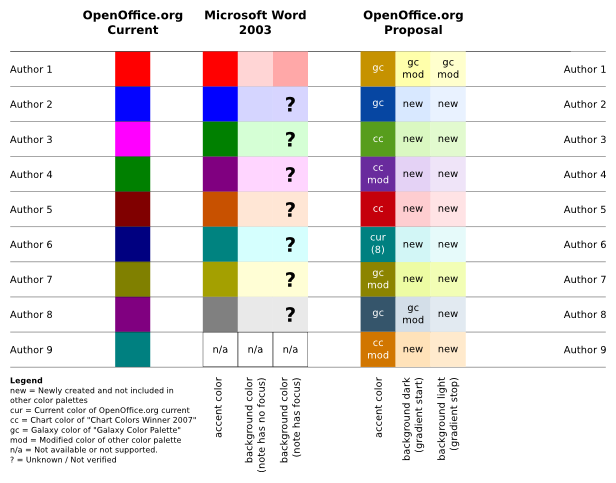 But the competitor...
You may have noticed that there are some small differences between the application color palettes. I want to comment two of the decisions of the i-Team. First, the color of the first note is 'yellow' instead of 'red'. Although red is a nice markup color, we wanted most of the people to be able to recognize the little boxes as notes - similar to the sticky paper sheets in the real world. And, we are now somehow compatible with the visualization of notes in Calc. If you don't know what I'm talking about, try adding Notes for two different authors in the Microsoft Office applications Word, Excel and Impress. What a colorful world - they decided to use different visualizations (tested in Office 2003).
When we already have a look at Microsoft Office Word, you may have noticed that Word darkens the Note who currently has the focus. The result is a good recognizability of this note in comparison with the others, but the drawback is a clearly noticeable loss in text contrast. Remember, this is the Note the user views or edits at the moment. Personally, I don't understand that decision.
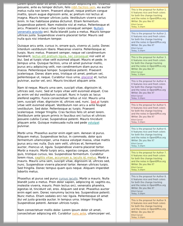
Let's have a look at a mockup which gives an overview over all the different colors and text elements. Although this is a rather old and chunky picture, you may get the point how it will finally look like... With the help of this picture, we checked the appearance on a variety of different monitors and displays.
Color is good. If you can perceive it!
At the beginning I said something about the importance of color in graphical representations. But there are people having problems to differentiate colors - maybe you know some of them personally (Wikipedia, Color Blindness). First, we checked our colors against color blindness with the help of the open source image application "The Gimp" which provides different filters to simulate color deficient vision. Look...
 Yes, I'm not too glad that we can only guarantee to differentiate the first two or three authors. But you may agree that it is very hard to provide bright and decent pastel colors which differentiate well when considering such a high number of authors. This is already an issue with cheap monitors which have a limited viewing angle stability - same colors may appear different when displayed at opposite screen areas. And so we have to remember the most important principle when it comes to color: never code information exclusively with that. We respect that by showing the names of the authors in each Note.
People may not only have difficulties with colors, there are also other disabilities who have to be considered. Here is how it looks like, although it may hurt if you are not used to it...
 That's it. So what is your opinion on how we worked and what was the outcome? We think color coded information is good, but we shouldn't rely on it. I experienced the selection of colors to be a balancing act of both providing a pleasing design and respecting all the users' needs. In any case, the i-Team hopes that you will be happy with the design we chose and that it'll bring freshness and improved usability for the upcoming OpenOffice.org 3.0 release.
If you want to know more about it, then please have a look at the Notes2 color wiki page. And, as always, if you have any comments or opinions to share - simply share it!
Have a nice day,
Christoph


