Wednesday, November 5, 2008

Nothing really thrilling today, but at least my first attendance on an OpenOffice.org conference...

The opening ceremony was held in a official building (Diaoyutai State Guesthouse) which was decorated in the colors of the OOoCon 2008. Although being a bit different in comparison with the 'blue' OpenOffice.org, all media (presentation screens, banners, cards, ...) seem to be carefully designed and are very consistent. It was a pleasure to look at:


After the ceremony, which seemed to be a bit long, we drove on to the Peking University. There, the Sun User Experience team members Bettina Haberer and Christian Jansen held the first presentation: "What's New in OpenOffice.org 3.0?". Although there were some issues with the data projector and the internet connection, they demonstrated how OpenOffice.org did improve over time. And now you can judge if the persons on the picture did improve, too :-)


The evening was spent together with e.g. the Sun UX team, some Sun Writer team members and the German community. Like the evenings before, there were discussions about the project, how to handle issues, how to manage new features in Writer and the quality of the Chinese beer. Not bad, by the way. So we "ended up" in the bar of the hotel. And, most probably, some people may still be there... As I said, no surprise today.


So enjoy the rest of your day,

Christoph

Tuesday, November 4, 2008

Oh, it's pretty late!

Wow, it's about 2:30 am now... it has been a great day before the conference really starts (great except playing the tourist).

So, after an extensive breakfast, some attendees moved towards a coffee bar to get some "real coffee". And, some bits and bytes from the "free" (as in beer) WLAN internet connection. I think, it has been a very funny discussion and I enjoyed to get in touch with some German community members I didn't knew much about, e.g. Jacqueline Rahemipour, André Schnabel, Stefan Taxhet and Andreas Mantke (see the post yesterday):

At 2 pm we had finished to work on our mails. We went back to the hotel and picked up some members of the Sun User Experience team and Max who just arrived. They starved from hunger. So we continued our discussion during a great meal. We decided that the most delicious dish was the "exploded chicken" (own interpretation). Let's have a look at Christian Jansen (Sun UX), Frank Loehmann (Sun UX), Max Odendahl (OOo development) and Andreas Mantke starting the meal (from left to right):

After being filled with an enourmous amount and variety of food, we went on to see the "Lama Temple" which is located in the center of the city. Like yesterday, we missed the opening hours by a few minutes ... Ouch! Instead, we took the chance and walked around in the smaller (and maybe less beautiful, but also interesting) streets - like in the picture here:


Do you miss something? I think yes, because I didn't talk about the next meal.... A very large group of people joined a meeting in a restaurant nearby. Perfect dinner which brought up a very interesting UX discussion. One of the people involved was Cor Nouws (OOo contributor, e.g. NL marketing contact). From left to right, front to rear ... various people except me:


Finally, I don't want you to miss two very interesting UX bits I found today, both located in the Beijing metro. First, there is a very interesting button on the ticket vending machine:

The description is rather far away from the button, and the pictures itself help nothing at least. But what could it be on the first sight? It is round, red and protected by a transparent cover to avoid unintended activation. Best guesses: The self destruction mechnism? The ultra-secred rocket launcher? No, it seems to be the help button... but I still don't know if it is for emergency use. Anyway, we should re-think the OpenOffice.org menu item to make it look similar to prevent people from opening the help. This would greatly reduce the efforts for maintaining it :-)

A much better idea was to put braille texts on the handrails for the staircases. This idea rocks and shows how information can be integrated within physical objects: the staircase both leads into a certain direction and will be touched most propably (at least blind people will use it).

Now, I will get in touch with my bed. I'm looking forward for my first official conference day...


Bye, Christoph

Monday, November 3, 2008

Christoph, this is Beijing. Beijing, this is Christoph.

Finally, I'm in Beijing. It's hard to believe...

The flight was good and I arrived at the Beijing Capital Airport at about 10 am. Before I left the airport building, I noticed a guy with an "OpenOffice.org" neck strap and made my very first contact with another attendee: Claudio Filho. So people, please don't forget those important indicators! I don't have one yet ... and my excuse: this is my first OOoCon.

Together, we took the bus to the hotel. The closer we came to our destination, the more attendees we met. In the hotel, we met Peter Junge, who is one of the main conference organizers. We took the chance and went to lunch with him - so he was in charge to select some very delicious dishes for us. Thanks Peter, it was ... yummi!


The picture shows our group before the meal. That's better, because afterwards the table looked less shiny. We will soon get used to chopsticks :-) Anyway, from left to right: Christoph (it's me), Claudio Filho (BrOffice.org Project), Florian Reuter (Novell), Andreas Mantke (German OpenOffice.org Portable Project) and Peter Junge (RedFlag 2000).

After the meal, some of us headed towards the "Big Bell Temple". Unfortunately, the area was closed in the moment when we just arrived, so we missed that opportunity. Instead, we took a photo from Mr. Small Bell.


Bang. That wasn't the bell... the jetlag came instantly and we hurried up to get "home" and some sleep.

Later in the evening (I went out to get some fresh air), I noticed that the entrance hall now looks like an real entrance hall (tomorrow, I expect more people to fill the space).


After all, it has been a very nice start for me! So I'm looking forward to see the other UX team members who will join tomorrow...

See (and meet?) you!
Christoph

Thursday, October 30, 2008

See You in Beijing!

Long time no blog post. Believe me that will change soon!

Christoph Noack, Bettina Haberer, Christian Jansen, Andreas Bartel, myself and many more UX team members will attend the OpenOffice.org Conference in Beijing next week.


Stay tuned and follow our State of the UX project presentation. There are great news!

So see you in Beijing!

Frank

Thursday, September 4, 2008

Interiour decoration - the colors of the new Notes

Colors are bad. Are they?

Some months ago, after the release of the OpenOffice.org 3.0 Beta, some Germans discussed the new Notes in a newsgroup (I don't remember the URL, sorry). There, one user referred to the notes being to colorful. He stated that it would have been better to use no color at all. Personally, I'm a little bit sad how this property of the Notes is perceived. So I would like to give some explanations a try.

Basically, color is an important information carrier and provides clues about the author of the notes. This is similar to the word processor of our biggest competitor. For me, it was no surprise that this request was estimated to be important to work on (different to other requirements which needed some more ... persuasiveness).

We only need colors. And...

The i-Team worked on it for several weeks: defining colors, gradient style, effect, visibility, ... Our requirements were (simplified):
  • provide a fresh and modern look, but avoid to distract the user from the actual text document
  • keep consistency with existing visual design work (e.g. with the Galaxy Icons Color Palette)
  • be based on the color palette of previous OpenOffice.org versions and the biggest competitors
  • consider the maximum number of different authors in the document
  • provide compatibility with the markups of the Change Tracking feature
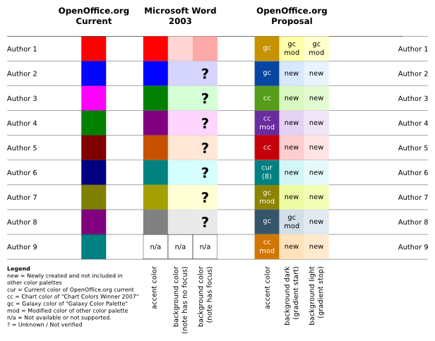
Okay, so how do the colors actually look like? Let's have a look at the color table which has been developed...
But the competitor...

You may have noticed that there are some small differences between the application color palettes. I want to comment two of the decisions of the i-Team. First, the color of the first note is 'yellow' instead of 'red'. Although red is a nice markup color, we wanted most of the people to be able to recognize the little boxes as notes - similar to the sticky paper sheets in the real world. And, we are now somehow compatible with the visualization of notes in Calc. If you don't know what I'm talking about, try adding Notes for two different authors in the Microsoft Office applications Word, Excel and Impress. What a colorful world - they decided to use different visualizations (tested in Office 2003).

When we already have a look at Microsoft Office Word, you may have noticed that Word darkens the Note who currently has the focus. The result is a good recognizability of this note in comparison with the others, but the drawback is a clearly noticeable loss in text contrast. Remember, this is the Note the user views or edits at the moment. Personally, I don't understand that decision.

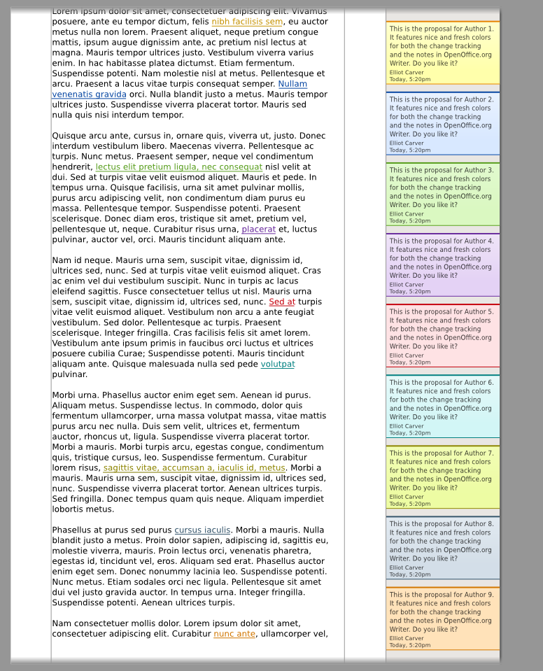
Let's have a look at a mockup which gives an overview over all the different colors and text elements. Although this is a rather old and chunky picture, you may get the point how it will finally look like... With the help of this picture, we checked the appearance on a variety of different monitors and displays.


Color is good. If you can perceive it!

At the beginning I said something about the importance of color in graphical representations. But there are people having problems to differentiate colors - maybe you know some of them personally (Wikipedia, Color Blindness). First, we checked our colors against color blindness with the help of the open source image application "The Gimp" which provides different filters to simulate color deficient vision. Look...
Yes, I'm not too glad that we can only guarantee to differentiate the first two or three authors. But you may agree that it is very hard to provide bright and decent pastel colors which differentiate well when considering such a high number of authors. This is already an issue with cheap monitors which have a limited viewing angle stability - same colors may appear different when displayed at opposite screen areas. And so we have to remember the most important principle when it comes to color: never code information exclusively with that. We respect that by showing the names of the authors in each Note.

People may not only have difficulties with colors, there are also other disabilities who have to be considered. Here is how it looks like, although it may hurt if you are not used to it...

That's it. So what is your opinion on how we worked and what was the outcome? We think color coded information is good, but we shouldn't rely on it. I experienced the selection of colors to be a balancing act of both providing a pleasing design and respecting all the users' needs. In any case, the i-Team hopes that you will be happy with the design we chose and that it'll bring freshness and improved usability for the upcoming OpenOffice.org 3.0 release.

If you want to know more about it, then please have a look at the Notes2 color wiki page. And, as always, if you have any comments or opinions to share - simply share it!

Have a nice day,
Christoph

Thursday, August 14, 2008

Let's do the Math

This time I'd like to point to something which is in early stage of development. The "OpenOffice.org Usage Feedback Extension" [1]


The OpenOffice.org Usage Feedback Extension is an extension that collects anonymous data about how OpenOffice.org is used. This information is used to better understand how people use OpenOffice.org.

Our plan is to have this extension final on release date of OpenOffice.org 3.0.

As mentioned above, the data will be used to do some statics on the usage of OpenOffice.org. For example: We can better figure out how frequently specific menu- and tool bar items are used. The collected data will help us to create a decision base for user interface changes. It allows us to decide better on defaults, or items displayed by default.

The anonymously collected data will be published in form of diagrams/tables on a page on OpenOffice.org.

As always, feedback and comments are welcome.
Directly here, or on the discussion page of the Extension Specification.

There is momentary nothing to download, but this will change soon.

Stay tuned.

[1] http://wiki.services.openoffice.org/wiki/User_Experience/OpenOffice.org_User_Feedback_Extension

Monday, August 11, 2008

OOo User Experience Project Lead Meeting in Hamburg

Sun Microsystems User Experience team had a meeting with Christoph, our OOo User Experience Co-Lead. Christoph stayed in Hamburg to meet his Notes2 iTeam, so we used this opportunity to prepare the upcoming quarterly review for Writer and to discuss general UX related things.


From top left to bottom right: Christoph Noack (OOo UX), Éric Savary (Sun QA), Max Odendahl (OOo Dev), Mathias Bauer (Sun Dev),
Christian Jansen (Sun UX), Andreas Martens (Sun Dev), Frank Loehmann (Sun UX)


I think the meeting was very productive and we also had much fun showing Christoph and Max a little bit of Hamburg at night. After dinner we went down to the harbour to have a look at the Hamburg Cruise Days. Nearly every ship/building was illuminated with blue light.


Blue illuminated Rickmer Rickmers and Disneys Lion King musical hall in the back.

I hope we can repeat those face to face meetings beside our weekly telephone calls.